Interview with strategic brand & packaging designer Joost la Housse about the printing effect: Hot Foil Stamping.
- News
- |
- 12-11-2020
- |
- from Vrijdag Premium Printing
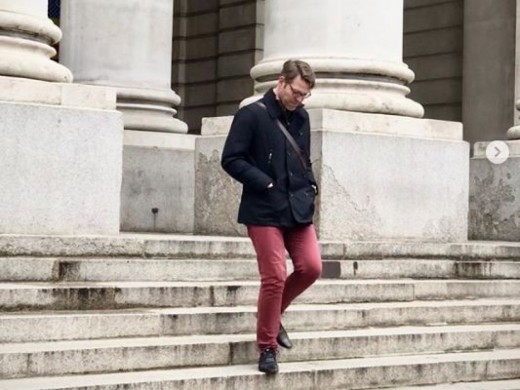
Joost la Housse, owner of Joost Identities, is one of the packaging developers who participated in a series of short videos highlighting special printing effects by Vrijdag Premium Printing. The printing effect that emerges in the video with Joost is about hot foil stamping.
"The printing effect “hotfoil stamping” responds to brand experience"
Discover Joost la Housse's theatrical vision on packaging and the power of printing to effect a brand identity. Joost's motto is: Creativity with Personality. A brand is more than just visual design. It is, like us, a human being who needs an identity and a unique personality. Joost la Housse packaging designs, aim to let a brand breathe, let it live, make it grow, and make it relevant so that it has meaning.
Joost, are printing effects a “must-have” to better emphasize the identity of a packaging?
Joost: When building a brand you first look at the inside. Who are you? What do you stand for? What do you want? Next it’s about appearance. What do you want to look like and how do you want people to see the identity of your packaging?
Brand design is key in this process, of which packaging is a big part. The brand personality reflects through the appearance of packaging. Material, tactility and finishing. Printing effects can have an enormous contribution to this.
When do you qualify that packaging has a personality?
Joost: Just like you, a brand should have human qualities with inspiration and meaning. Only then you touch the other in the heart and a personality is created. This awareness makes a packaging stand out from the shelf, and that’s what makes it extremely interesting and desirable.
According to you, a packaging design should be relevant and innovative. How can you incorporate these aspects in packaging?
Joost: This is a combination of factors. A clear concept, tone-of-voice and design language. Being innovative is different for each brand. What feels like an evolution for one can be a revolution to the other. Every project has its challenges and I like to explore, with my designs, the edges of what is possible within the relevant playing field.
What do you think are the main packaging trends of the moment?
Joost: More and more brands starting to expressing themselves what they stand for. Sometimes in an activist way or in a comfy way, and that can be divided into various design trends:
- The "Pinterest Gen Z" trend: pastel colors, minimalism, clear, sleek and graphic. At first sight always cheerful honest designs without much depth.
- The Vegetable trend: abstract shapes, complementary colors, direct tone-of-voice, often feels local and not like mass production. Green in every way. Using illustrations.
- The Maximalism trend: excess, escaping the present time. A lot of detail, an abundance of ornaments, a lot of refinement and effects. Crazy concepts. Clash of colors and patterns. Bold, lots of typography.
- The Humane trend: light earthy tones, round shapes, close and clear in tone-of-voice, clean and trying to enrich the life of the consumer instead of selling something.
Besides clients in food, I also work for clients in beauty. There are more similarities there than you would initially expect. The starting point is the same and the story just as important. Here too sustainability is increasingly included in the process. Personally, I am curious what the developments in the field of AR will mean for packaging design. Because customers are increasingly making online purchases, the question is also increasingly asked to include this in the packaging design.
Which foil color tones are popular? And why?
Joost: Holographic foil effects can be encountered more often. It radiates a kind of science, which does very well on food and beauty packaging. Science in combination with natural look & feel is also an upcoming trend.
Foil colors like copper are warm, catchy and feel close. They can be seen in packaging for non-alcoholic drinks and beauty. Often used just as a detail and not all-over.
The demand for sustainable packaging is growing. Do you notice that your customers are aware of what is possible in the field of sustainable printing effects?
Joost: To be honest, sometimes they are better informed than me! Regarding sustainability, companies are so active with innovations simply because consumers demand it. You can lose yourself in it completely and go all the way, but it’s important to design with common sense.
During each project it’s good to keep an eye on how much sustainability you can incorporate. Not only a packaging can improve its sustainability, but also customers can optimize their processes. Every sustainable step, how little, is one step forward.
Does a special printing effect increase the value of a packaging and help it stand out on the shelf?
Joost: A special printing effect increases the value of the packaging and helps it stand out on the shelf. A customer wants a package that radiates value, pampers and provides an experience.
With hotfoil stamping on packaging the daylight and electrical lighting in the shop also plays a role. The impact that lighting has on foil helps to seduce the consumer and the stand-out of the packaging. The reflection, spacial shape and color of hotfoil stamping on packaging come to life with good lighting.
What do you think is important in the collaboration with a printing company?
Joost: I am looking for a printing specialist who knows what he is talking about. Someone with the right skills who I can surrender to. As a designer, I cannot keep up to date with the printing ins and -outs. That is why a sparring partner and a specialist that takes that extra step is so nice to work with.
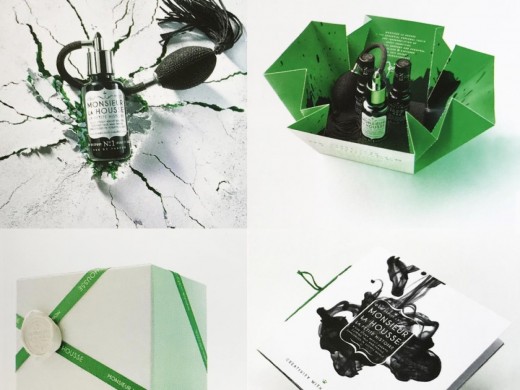
A good example of this, is the exclusive parfum gift packaging design 'Artisan Fragrance Monsieur la Housse'. I designed this for the 10-year entrepreneurship anniversary of Joost Identities. With the help of Vrijdag Premium Printing the result was a success. It's so important to work with the right partners. That is why I like to work with Vrijdag Premium Printing.
Thank you Joost for your time and your participation in this short video about hotfoil stamping.
Are you looking for a packaging design with a strong personality? Contact Joost la Housse!
Joost Identities
Joost la Housse
Thomsonlaan 26
2014 TT Haarlem
The Netherlands
Phone: +31 (0) 6 10392830
Email: info@joostidentities.com
Website: www.joostidentities.com
Follow Joost Identities on social media!

