
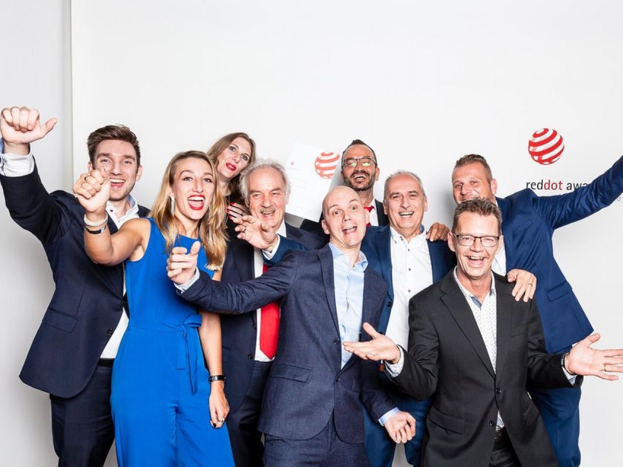


Interview with strategy director Rob van Heertum (VHD) about the printing effect: Sparkling Mineral Powder.
- News
- |
- 23-11-2020
- |
- from Vrijdag Premium Printing
Rob van Heertum, strategy director for Van Heertum Design (VHD), is one of the packaging experts who participated in a series of short videos highlighting special printing effects by Vrijdag Premium Printing. The printing effect that emerges in the video with Rob is about Sparkling Mineral Powder.
"Sparkling Mineral Powder, perfect for eye-catching packaging"
VHD - “Converting your brand story into packaging, since 1971”.
Yes, packaging is more than just paper or cardboard. It has charisma and a story to tell. Packaging designed by Van Heertum Design VHD is unique and has a premium feel. Meet Rob van Heertum and discover his vision on packaging and the power of printing effects.
What do you think are the packaging at the moment?
Rob: Our latest trend presentation, which we compile annually for our customers, identifies the following packaging trends:
- COLOR; Simpler use of colors. Meaning using 1 or 2 colors at most. But more striking colors and unconventional color combinations.
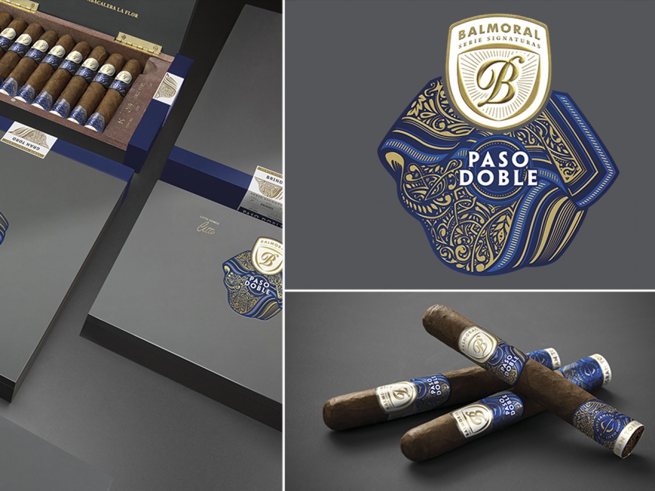
- DETAILED ILLUSTRATIONS; The countermovement to the minimalism trend we've experienced during the last few years. This means elaborate and detailed illustrations, use of ornaments and foils. The packaging conveys clear luxury.
- GEOMETRIC SHAPES AND PATTERNS; The use of geometric shapes and patterns are a returning trend. They are a versatile and elegant means to use shapes and colors. In such a way that allows you to communicate a clear overall brand identity or flavor on the packaging in a timeless and yet modern way.
- METAMORPHOSES; Detailed illustrations that show different types of transformation or metamorphoses. They can help brands to be memorable and stand out from the crowd. There's more than the first catch of the eye, and it helps to tell the brand story.
- NATURAL SHAPES AND COLORS; As an extension on the environmental trend, packaging will also show more natural shapes and colors. This will no longer exclusively for companies that already had an "eco" agenda.
- PANTONE STYLE; Pantone presents their colors with the swatch being the biggest surface and the information presented in the same format at the bottom. This inspires the new trend we call Pantone style: Big colored areas combined with white and a simple presentation of logo and information.
- PLASTIC FREE; Climate change and the use of sustainable packaging are still a hot issue. This has been a big trend over the past few years and will be for years to come. Designers are experimenting with many new packaging materials.
- REDUCED READABILITY; Readability takes a backseat to big recognizable elements and colors. Brands won't be limited by the visible area on a packaging, cropping words or logos without hesitation. Nor will they refrain from using expressive fonts or overlap words and elements if it reduces legibility.
- SIMPLE ILLUSTRATIONS; As a countermovement towards the highly detailed illustrations in the luxury packaging, other brands will choose to use more simple, flat or vector illustrations to tell their brand story.
How important is a print effect to make packaging stand out on the shelf?
Rob: Depends on the rest of the shelf. If a shelf is overloaded with refined packaging, printing effects will not give the desired result. But in general this is not the case and adding a print effect to a packaging does add value. It is important for a brand to stand out and catch the eye of the consumer. Consumers nowadays are racing through the shelves so the more the packaging stands out, preferably with a special printing effect, the sooner it will be noticed.
What makes Sparkling Mineral Powder so special in your view?
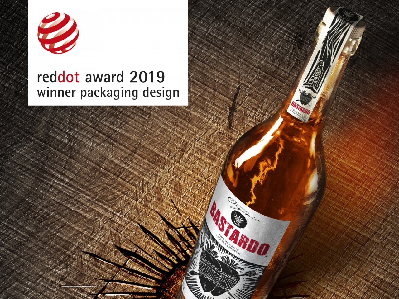
Rob: Basically Sparkling Mineral Powder is a replacement of the old dust-bronzing, but now in an environmentally friendly version.
Next to that SPM offers more colors than just gold. Having the option to choose from a larger color scheme opens the door to new packaging design and markets.
In addition, SMP shows a very special effect when getting close. Adding SMP to a packaging adds shelf value and power to stop the consumer at the shelf. Stopping power is the second step in the 'buying' process of a customer which means: holding a packaging in their hand and a close-up also impresses you and will convey a unique and authentic story.
Sparkling Mineral Powder is a sustainable printing effect. Is this important to your customers?
Rob: Super important. Nowadays customers value sustainability. By offering an environmentally friendly printing effect, you’re as a designer a step ahead and it offers us the option to participate in the complete design process, whereby “sustainable” is already thought of at the beginning.
Which Sparkling Mineral Powder color tones are popular?
Rob: There is a whole range of SMP colors, but which are popular now… difficult to say. Especially gold will always remain popular for this solution within the luxury markets. But it is precisely the new contemporary colors that were not able in the traditional dust-bronzing can appeal to new young markets. And in combination with normal printing colors the spectrum is actually endless, so there is something for everyone.
The demand for sustainable packaging is growing. Do you notice that your customers are aware of what is possible in the field of sustainable printing effects?
Rob: Most of them not, but everyone has his or her profession. We and the printer are also there to keep the brand manager informed, to advise and to include this at the beginning of the design process and to define what the possibilities are.
What do you think is important in the cooperation with a printing company?
Rob: That they play a good advisory role and of course deliver quality. Working and switching quickly is also a must nowadays. In addition, it is important that, next to give advice, they also respect the design and do not try to make it their own. So with respect for the “design” try to implement this as well as possible, without changing all kinds of things.
Thank you, Rob van Heertum for your time and your participation in the video series about printing effects.
Do you want to convert your brand story into packaging? Please contact Rob van Heertum.
Van Heertum Design VHD
Rob van Heertum
Gasthuisring 23
5041 DP Tilburg
The Netherlands
Phone: +13 542 7610
Email: info@heertum.nl
Website: www.heertum.nl
Follow Van Heertum Design on social media!


